← My Works
Pocket-Ready Design: Where Insights Shape Effortless Mobile Experiences
ROLE: UX DESIGNER
ELASTIC PATH COMPOSABLE COMMERCE, SAAS: MOBILE EXPERIENCE
4 min read
An Open Question
Do we even need a mobile experience? Is it essential—or just a gimmick? A mobile app for the sake of having one?
Elastic Path values autonomy and innovation. Every year, the product development team gets a two-week sprint for a hackathon—time to explore anything you're passionate about. This year, my frontend engineer got me excited about two ideas she’d been brewing for our composable commerce product: a new dashboard and a redesign of our mobile experience.
A year ago, we rebranded. While we managed a quick reskin—brand colours (going from royal blue to commerce green), general aesthetics, and new navigation—we noticed glaring gaps in our mobile optimization. The navigation wasn’t mobile-friendly, and the existing experience struggled on smaller devices. With demanding roadmaps and constant builds, iterating on mobile had never been prioritized.
Grounds
To decide whether a mobile experience was worth pursuing, we first needed to understand its current usage. Diving into our Posthog dashboard, we expected near-zero mobile engagement—but we were surprised to find significant traffic.
The high bounce rate was no surprise, given the experience barely functioned. Still, it confirmed user interest in accessing the platform on mobile.
“It’s interesting to see who uses it—and keeps returning—despite how broken it is,” one frontend lead remarked during an interview. Surprisingly, we found such a user: a CTO repeatedly accessing analytics and order insights.
Another key finding was a spike in Free Trial users—aligned with our Product-Led Sales initiative. We concluded that prospects often vet our product through mobile, making it a crucial entry point for first impressions.
Quality Over Quantity
Given the broken state of our mobile experience, we knew quantitative data alone wouldn’t provide the full picture. We leaned on qualitative research, engaging internal stakeholders with deep product knowledge—engineers, product managers, customer success reps, global services, and functional specialists.
With only two weeks, we had to quickly sketch mockups to visualize our ideas and validated them through stakeholder interviews. Each interview focused on two aspects: feature usage and customer insights, followed by a quick prototype walkthrough.
From these conversations, we gained invaluable insights about user behaviour, expectations, and workarounds. These findings became the backbone of our design evolution.
Rough prototype to illustrate ideas and direction.
Evolution through Learnings
With our research guiding us, we honed in on key on-the-go use cases for mobile:
Time-sensitive issue resolution: Pulling live promotions or disabling user access.
Simplified tasks: Reserving complex, error-prone actions for desktop.
Actionable notifications: Keeping users informed of key updates and needs for user action.
Quick sharing and bookmarking: Supporting collaboration and enabling users to resume tasks later.
Customization: Allowing users to surface information relevant to them.
High-level analytics: Catering to leadership who need concise, big-picture insights.
Notifications system highlighting time-sensitive action prompts for on-the-go use cases.
Displaying only key information and actions for Promotions, leaving editing of Rule Builder capabilities to the desktop.
Leaving complex tasks to desktop.
Circling Back to the Primary Experience
One of our main goals is to bring insights back to our primary desktop experience. Key takeaways included:
Notifications: Users found notifications critical for staying on top of important actions, which were entirely absent from our platform.
Customization: Current reliance on object IDs (e.g., random strings) made tasks frustrating and error-prone. Allowing users to choose meaningful identifiers became a priority.
Ease of navigation: Tasks like data erasure required jumping between screens to manually input IDs—often inaccessible and buried in the URL.
Mobile’s constraints helped us prioritize essentials, influencing broader platform updates.
Designing an action-based notifications system.
Exploring options to better display dense information on Orders screen.
Customized Orders screen—surfacing only relevant information for easier scannability and reference.
Back to Basics
When my frontend engineer shared her ideas, I jumped in almost instantly.
For a while, I’d been craving the chance to do some truly grounded design work—designs that weren’t rushed or reactive, but built on thoughtful, intentional decisions. Too often, we were chasing the next cool feature, rushing to deliver, or iterating reactively.
On desktop, it’s tempting to fill the wide canvas with features and options. But is that the right approach? Too many choices can overwhelm users, creating cognitive overload. Where would they focus? Where would they start?
Despite the creative freedom we enjoyed, we grounded every decision in extensive research and user interviews.
A Surprisingly Rewarding Wrap
When we first proposed the project, we faced skepticism and even objections. Our technical director questioned whether mobile was meaningful enough to tackle and worried it wouldn’t foster growth. The customer success team shared concerns about exposing users to potential errors, deeming it too risky.
But as we shared our findings, perspectives shifted.
At the end of the hacksprint, teams presented their work for voting in four categories: Best for Customer, Best for Internal Tools, Best for Product, and My Favourite. To our surprise, we were nominated in all four categories, placing second in three—even in “Best for Internal Tools” (giggle 🤭)!
Unbelievable, considering we had little more than a Figma prototype while other teams delivered fully developed projects.
It was the first time our company celebrated something so design-focused, and not just an end delivery. Our technical director went from being skeptical to our biggest advocate, encouraging us to share our findings beyond the hacksprint, across teams.
This recognition—and the opportunity to push design’s boundaries—made this project truly unforgettable.
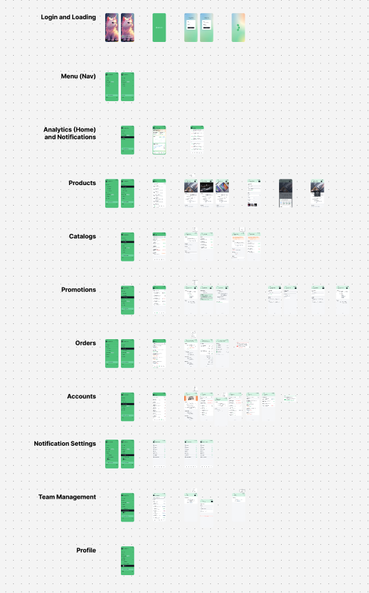
Screens for iterated prototype for final presentation.


